 Shopping Cart


A couple weeks ago a person reached out asking how to identify fake Parker Sonnet pens. The first thought that crossed my mind was, “Who would want to fake a Parker Sonnet?” Don’t get me wrong. Sonnets are very nice pens. But, there are a ton of used authentic ones out there for very, very affordable prices.
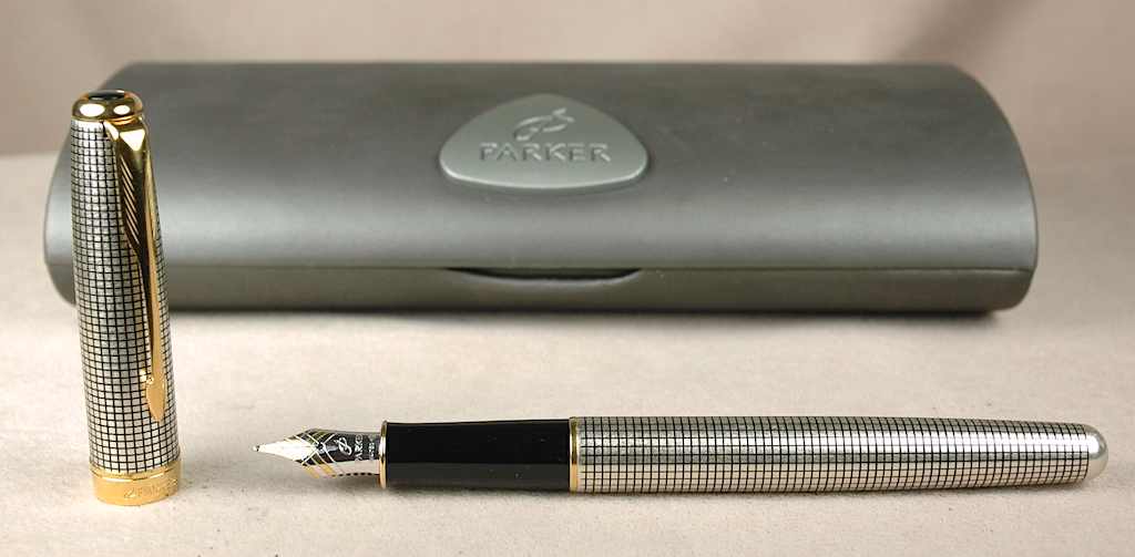
Here is a fake Parker Sonnet imitating the silver Cisele design. It even comes with a box that showcases all of the Parker design language…though it doesn’t match the design of authentic Parker boxes.
This person told me that next to Montblanc pens, the Parker Sonnet was the most faked pen out there. I have no data to verify that, but I also have no data to disprove it.
Well, sure enough, a collection of pens from a different person showed up in our P.O. Box, and among the pens was an initially convincing fake Parker Sonnet!
From my own experience, the Parker Sonnet cisele/cicelé design is among the most popular. This is the sterling silver version of the pen with a grid pattern on the cap and barrel. The Sonnet first was released in 1994 and has been in continuous production ever since. The cisele model has been a part of that production since the beginning, too. As such, it is not uncommon to see tarnished silver in these pens. At first glance, the finish on the fake Parker Sonnet above looks like a lightly tarnished authentic pen.
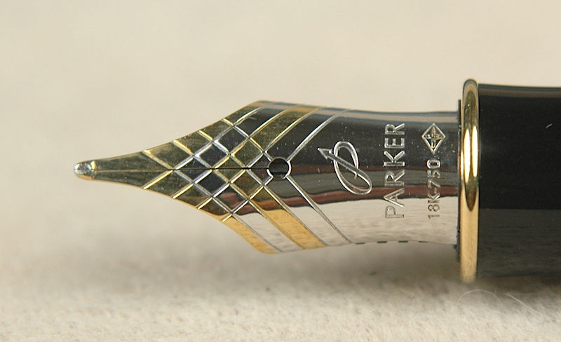
Fake Parker Sonnet nibs are steel nibs. This nib had a gold plating that came off when polished. Also note the lack of crisp imprints, especially on the smaller fonts.
What gave away the fakeness of the pen to us was when we started cleaning it up. Initially, the nib looked like the 18k gold it was stamped as…only really dirty with old ink. After we soaked it, we went to polish it. That is when all the “gold plating” came off. Even the authentic pens with non-gold nibs don’t change colors when they get polished. And so, we began to take a closer look.
We don’t have a scale that is sensitive enough to measure the weight of pens in greater detail, but the fake Sonnet feels lighter than the true Sonnet. Many authentic Sonnets have a brass barrel foundation for whatever the exterior shell looks like. The fake Sonnet hasn’t this feature. Obviously, the fake shell isn’t real silver and doesn’t clean up.
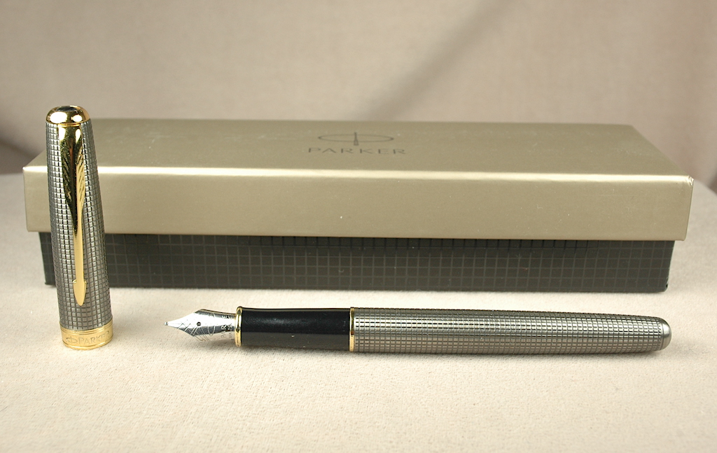
This is an authentic sterling silver Parker Sonnet with the Cisele design. Please also note the clam-shell box behind it.
Imprints also help give away the fake pen’s true nature. If you’ve handled real Sonnets, the imprint on the fake looks very, very close to the real thing, but they have imperfections and aren’t as crisp as the real thing. Also, the inkfeed under the nib doesn’t have a crisp cut like the real pens, and it isn’t in contact with the nib to allow proper flow. The black plastic jewels are smaller than on the real pens. Annnnd, some of the fake Parker Sonnets used Chinese converters that look like real Parker converters but have a different aperture size, meaning real Parker converters won’t fit and work on the fakes.
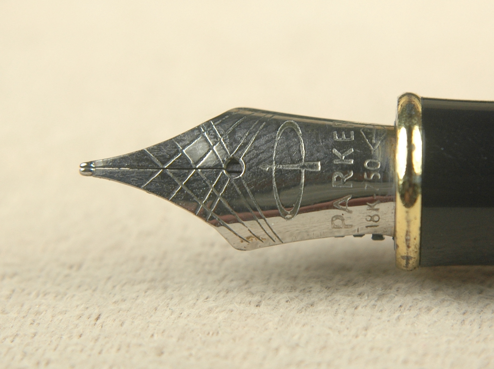
An authentic two-tone 18k gold nib polishes up well without all of its gold disappearing.
Another indicator of the fake Parker Sonnet is the presentation box on the top photo. The design language of the box is impeccable. However, real Parker presentation boxes have a cardboard outer box and a clam-shell inner box of some kind. Box designs change frequently, but Parker never uses a box as small as the fake one…nor without an inner box.
Perhaps our attempts to help identify fake Parker Sonnets is not quite complete. We have only seen one in real life, so far. Parker has made subtle changes in its Sonnet designs during the past 30 years. So please feel free to add comments for other details about fake Parker Sonnets that we might have missed or have yet to see. Thanks for help keeping it “real.”