Author Archives: Nathaniel Cerf

About Nathaniel Cerf

Nathaniel Cerf is the owner of ThePenMarket.com. He has been a fountain pen junkie since the age of 9, but his addiction got out of control around 2004, when he began to learn the art of fountain pen repair.

In addition to his pen activities, Nathaniel is a professional writer with a master’s degree in journalism from The University of Montana. A former Gannett newspaper editor, he has also been published in magazines as diverse as Montana Journalism Review, Nostalgia Digest, American Fencing (that’s swords not barb wire or picket) and True Confessions. His photography has appeared in the Chicago Tribune, Argus Leader and American Fencing.

The blogosphere knows Mr. Cerf from “The Hat Chronicals” at www.hats-plus.com, where he created and currently maintains a blog committed to fedoras, pork pies and the history of headwear. He also originated a movie review blog for DVDPlanet.com.

Nathaniel is currently shopping an expose novel he has written about the children’s mental health industry. (Yep, he has a bachelor’s degree in psychology, too.)

If that isn’t enough to keep him busy, he coaches and competes in fencing. He maintains a national rating in foil, but he also dabbles in epee. (That’s the weird sword crossword puzzles always use.) He also continues perfecting the formula for peanut butter and mustard sandwiches and Flaming Hot Orgasmic Tacos from Hell.

Westenra Memorial: Stave I

EDITOR’S NOTE: The following is the first chapter to a book I have not completed. Quite frankly, I’m not sure anyone would want to read the whole book. As such, let me know what you think. Should I push ahead?

Stave I

This photo has nothing to do with the story, but didn’t a certain Transylvanian count arrive in London on a ship like this?

Cheers erupted in the operating room when Dr. Tepes removed his bloody hands from the chest of a morbidly obese man. The man’s heart had just restarted after one of the most masterful quadruple bypasses ever performed.

“That was inspiring,” said a young surgical resident. “How on earth did you know you’d find a suitable vein in his calf? His arteries were as congealed as the grease trap at an abandoned McDonald’s”

Dr. Tepes gave a wan smile and tried not to belie his boredom when he explained, “When you have has much experience as I’ve had, sometimes a body just talks to you. Besides, I’ve known this gentleman for several years in town and knew he was an athlete in younger years and suspected there might be additional clear veins in his lower extremities.”

The resident looked on in awe. “Yes, but he came in unexpectedly off an ambulance in cardiac arrest. To think that quickly and remember that well on your feet….”

Even the attending surgeon with 15 years of cardiac surgical experience was impressed. “Sir, that was the most incredible surgery I’ve ever watched.”

“Thank you, Joel,” Dr. Tepes said with warm friendly familiarity. “You really are one of the best cardiac surgeons I’ve ever worked with. That means a lot.”

The nurses agreed and complimented.

“Dr. Brown, do you mind closing him back up and putting the finishing touches on our patient?” Dr. Tepes asked.

“It would be an honor, Sir,” replied the resident.

“Great. It’s 2 a.m., and I’m more than a little hungry for a much delayed lunch break.”

“I’ll keep a close eye on young Brown,” Dr. Joel Irving replied. “I’ll catch up with you to go over the surgery for our notes when we’re done.”

Dr. Tepes thanked Dr. Irving wearily with a pat on the upper arm, as he passed him to head to the hall for his lunch.

Out of his scrubs and into his shirt, tie and white coat, Dr. Tepes listened to the echo of his comfortable gleaming black wingtips, as he walked down the tiles to what he darkly and privately referred to as his lunchroom. His office on the top floor was locked, and everyone assumed he was deep inside enjoying his private meal in solitude, as was his wont. He owned Lucy Westenra Memorial Hospital and only practiced surgery for fun, to keep his hand in the proverbial game. While he likely was the most talented cardiac surgeon on earth, he kept a low profile. He was a quiet soul who didn’t seek out fame or attention. He ran the hospital as a nonprofit to benefit the town of Sleepy Hollow, New York. Some insanely rich executives and movie stars knew of his talents, and they paid a fortune to improve their own lives and essentially fund the hospital for the community.

Uncas Falls in Norwich, Conn.

What bothered Dr. Vladislav Tepes wasn’t money or debt, it was shear boredom. A person’s heart and blood spoke to him in ways no one alive could understand, and it was no challenge at all to save a person’s life from cardiovascular problems or gunshots. He set out long ago to try to make amends for his past by saving lives, but he wasn’t even sure it was worth it any more. So few people changed their own lives afterward. So few dedicated their new lives to others or making the most of their own lives. Text books might one day be written about the surgery he just performed, but to him it was so rote that he almost fell asleep about three quarters of the way through it.

In his lifetime, he had seduced every size, color and shape of woman and man. For the past couple decades it was so beyond tedious, messy and boring that he didn’t even bother…or miss it.

He raced cars, flew airplanes, sailed around the world, partied with celebrities, mastered several languages, played several instruments and explored many hobbies from horology to horticulture.

Dr. Tepes looked like he was in his late 40s, but his family had long since passed away. He was stoutly built, and his pale skin and raven-black hair combed from right to left gave him a more youthful look, while his dark eyes and thin lips seemed to age him a little.

Outside of work, he had few friends. People were so predictable. By the time people got interesting to him, they died of old age.

Arriving at a glass-windowed door that said “Hospital Lab,” Dr. Tepes sighed with relief and entered. It was vacant at this hour, so he left out the lights and grabbed a large Pyrex measuring cup—filling it with all of the day’s leftover test tubes of already tested blood. He put the empties in the autoclave and put the cold, congealing mess in the microwave for 40 seconds to get it up to 98.6 degrees Fahrenheit.

***

Uncas Falls in Winter. Norwich, Conn.

Dancing down the hallway with his mop and wheeled bucked, few people loved their job as much as José Monterrey. José was the head janitor at Westenra Memorial. A happily married father of three, at 45, José felt like he was on top of the world. He had grown up poor in the rough border town of Juarez, Mexico. Through hard work and good fortune he came to the United States and became a naturalized citizen.

He looked past the petty racism of so many non-Hispanic Americans, focusing on the goodness of many other Americans and the opportunities available to his children that he barely dreamed possible at their age.

Unlike the jobs his parents had to do to get by, keeping a hospital sterilized and safe for patients and co-workers felt simple. Keeping his staff motivated and happy was likewise easy. Westenra Memorial paid top dollar for every employee and offered as strong a benefits package as he’d ever seen for what would normally be low-wage manual laborers.

“Lose a finger, get two free,” he’d joke to his prospective employees.

Only his wife protested.

“José, why don’t you go to day shifts and spend more time with us at home?”

He’d explain, “Rosie, it is so much quieter at night, and I can get so much more done. Plus, they need me there. The nurses and doctors are so stressed out saving lives, I clown around with them and ease their burdens. Same for some of the patients, who are scared and still awake. It isn’t in my job description, but this place is going to put our kids through college. Maybe they’ll be doctors here one day. It is important to give them everything I can.”

He smiled as he thought about his Rose. He twirled around his bucket and mop, pretending to dance with her as he made his way to the last room he needed to clean.

José had strict orders to stay out of the hospital lab when the lights were on or from midnight to 2 a.m., so he saved it for last.

It surprised him a little that the door had been left unlocked at a quarter to 3 in the morning, but the lights were out and people forgot to lock up all of the time.

The tall, athletic janitor flicked on the lights and gasped in horror when he saw the owner of the hospital drinking human blood from a glass bowl.

Dr. Tepes hissed in anger, bearing sharp, elongated fangs at the intruder.

José fell to his knees crying and begging. “Oh, please don’t kill me. I didn’t know! Nobody knows. I won’t tell anyone. I have a wife and children. Please, I’ll do anything you want. Just let me live.”

Dr. Tepes rushed to him with supernatural speed.

Examining Noodler’s Ink Part 1

The one ink brand everyone is always talking about is Noodler’s Inks. People either love it or hate it. There doesn’t seem to be a lot of middle ground. As such, we want to add our two cents to this conversation, and we surprised ourselves with our tests and findings.

Controversy seems to follow in Noodler’s wake, and, yet, it doesn’t seem to disrupt people’s passion for the ink. From the stains-everything-it-comes-into-contact-with Baystate Blue to clever (and occasionally offensive to some) ink names and label designs, Noodler’s is always a top-selling ink.

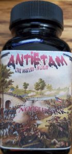
I first got hooked on their ink with “Antietam” ink. As an armchair Civil War historian, I knew Antietam was this single bloodiest day of fighting in all of America’s wars. There were nearly 23,000 casualties at that battle. I got a macabre kick out of the Antietam ink looking like fresh blood when wet and dried blood when dry. It remains my red ink of choice. The ink has never clogged my pens or created any problems.

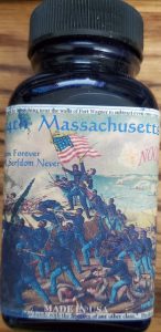
However, my favorite of their ink names is “54th Massachusetts.” As a regiment, it is the most famous African-American regiment of the Civil War. If you’ve seen the movie “Glory,” with Morgan Freeman, Denzel Washington and Matthew Broderick, it is that regiment. The American uniforms in the Civil War were blue. The men of this regiment were black. The ink color is blue-black. A clever ink pun. Unfortunately, as beautiful as the ink is, it clogs the hell out of my pens.

As a matter of fact, virtually every other Noodler’s Ink I have ever written with clogs my pens. As such, the only ink I use is Antietam, and I don’t recommend any other Noodler’s to anyone, unless they are only writing or drawing with dip pens.

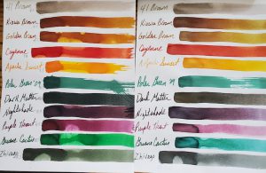
Here are 11 swatches of Noodler’s Ink. The samples on the left were the control samples. The inks on the right were in the sun for 9 months.

Nevertheless, when I bought a large collection of ink several years ago, it came with a large selection of Noodler’s. As such, Dawn and I thought we’d put it to the test. Today’s selection remained in my sunniest window for 9 months. We also pH tested the ink to see how potentially corrosive it might be. As a quick refresher the scale between acid and base runs from 0 through 14, with 7 being neutral, such as pure distilled water. As always, we calibrated our testing equipment before testing the inks.

We were absolutely stunned by how light-fast these colors were. At worst, they lost a little of their luster and vibrancy after 9 months of sunlight. Most didn’t lose anything! Very impressive.

Noodler’s Ink also claims its is pH Neutral. We did not find that to be the case in these 11 inks sampled. However, they were much better regarding pH neutrality than many other brands. The important thing to keep in mind is that just because an ink is pH neutral doesn’t mean it doesn’t have ingredients that will still corrode your rubber ink sacs, diaphragms and seals. We did not test these inks in rubber ink sacs. The pH results below are simply raw data points.

Noodler’s Ink Name     pH

41 Brown                     8.4
Kiowa Brown              8.5
Golden Brown            8.1
Cayenne                      7.8
Apache Sunset           7.5
Polar Green ’09          8.7
Dark Matter                8.6
Nightshade                 8.4
Purple Heart               8.5
Gruene Cactus           8.3
Zhivago                        8.7

In conclusion, these 11 Noodler’s Ink were amazing for their color-fast testing. The pH is a little on the base or alkali side but no where near as far off the mark as many other ink brands.

Don’t Get Fooled by Fake Montblancs: Metamorphosis

When I first saw the Montblanc Rouge et Noir Metamorphosis pens, I was confused by the fact they featured a spider. I was thinking of Franz Kafka’s “Metamorphosis” in which is main character Gregor Samsa wakes one morning to discover he is a cockroach. It took my good friend Tobias to remind me of Ovid’s tale by the same name in Greek Mythology, in which a woman named Arachnae does not give Athena–the goddess of wisdom, war and crafts–enough credit for being as talented a weaver as herself.

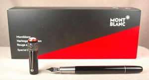
This is one of the three authentic versions we know of the Montblanc Rouge et Noir Metamorphosis limited edition pens.

Athena challenges Arachnae to a weaving duel. Arachnae wins with a tapestry showcasing the offensive behavior of the gods, which sends Athena into a rage. Athena shreds the offending tapestry and turns Arachnae into a spider and eternal weaver. Hence our modern scientific term for spiders being arachnids.

The modern, limited Montblanc pens are truly stunning pens that pay tribute to that story as well as some early designs of Montblanc pens in the 1920s. Unsurprisingly, fakers jumped on that design just as quickly as a spider jumps on a fly in its web.

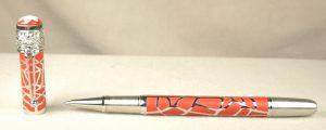
This is a very convincing replica of Montblanc Rouge et Noir Metamorphosis pen on the surface, but a closer look reveals its flaws.

From a cursory look, both the genuine article and the fake look very similar. We do not have the sterling silver spider web version of the original to show, but we do have the fake. Montblanc made a plain black version like the one we have, a plain orange version and a black with silver spider web version. To the best of our knowledge, Montblanc DID NOT make an orange spider web version. Furthermore, the original silver web is more like a filigree. You can tell on the fake that the orange is painted on to the steel pen with a raised webbing.

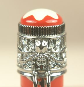
The fake version of the MB pen has the same spider logo, but it is a little less defined, as it is a copy from a casting.

The actual spider logo on the fake is very convincing, but when you look closely at it, you can see by its slight lack of detail that it is made from a casting of the original.

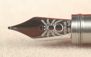
Our authentic fountain pen has two other features that the fake version in fountain pen often do not have. The authentic pens have a spider etched into the nib, while the fakes with a steel nib often have a more traditional “4810” nib design. Also, the real FP has a piston filler, not a converter, as many of the fakes do.

Many of the real Montblanc editions, but not all, also have ruby eyes in the spider.

With any luck, these pointers will help keep you out of some fraudster’s web of overpriced fake Montblanc pens.

Authentic Montblanc Metamorphosis pens have a spider on their nib.

Welcome to Our New Home Page

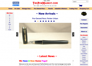
This is what the new home page looked like on Day 1 of our refresh. Please note the “On Sale!,” “New Arrivals” and search bar.

In our on-going efforts to make ThePenMarket.com to best place to buy writing instruments online, we just made some major changes to our home page. You can now search for bargains and discounts with our On Sale! pages. You can save time by only searching for our New Arrivals to find the latest writing instruments on the site in one easy-to-find spot. You can now search the site with a custom search bar. Annnnd, we’ve cleaned up our ZZ Top beard of daily updates and latest news on the home page.

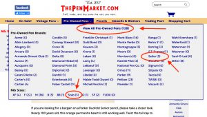
To help speed your searches by brand in “Vintage Pens” or “Pre-Owned Pens,” we added comprehensive list of brands in alphabetical order to a drop-down menu when you click either category of pens. Inside that drop-down menu a number by each brand will let you know how many pens we have in that brand, hopefully saving you time, especially when we are out of stock in a particular brand. However, if you love what record collectors might call “crate digging,” and you prefer our old lay out for cruising through all of the vintage or pre-owned pens in one shot, all you have to do is click the top center of the drop-down menu that reads “View All Vintage Pens (82).” Or “View All Pre-Owned Pens (128).” The 82 and 128 represent all of the pens we have in those categories today. Those numbers will change daily. You can also now use that same menu to search for all of the nibs in either section. If you only want to see the modern pre-owned pens with a stub nib…bam! There it is.


In the new Vintage Pens or Pre-Owned Pens drop menus, you can search all the pens, a single brand or all the pens in either section by their nib style.

We used to have at least 20 or more fonts on the website. Now we have updated, minimized and streamlined our fonts to make the site look more uniform and modern.

That ZZ Top beard of daily news was cleaned, shampooed and trimmed to be put in a more modular text box that you can read more easily with a simple scroll, while still navigating the home page more easily.

Best of all, this is only the completion of Phase 1 of our updates to help make ThePenMarket.com more user friendly. We won’t be done with this round of updates until we complete a 4th and final phase.

In the meantime, please let us know what you think. Also please feel free to let us know what you would do to make the site more convenient for you. Thanks!


When Pelikan Tried to Level Up

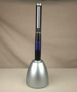
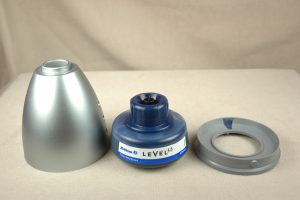
Here stands a blue Pelikan Level 5 fountain pen in its inkwell egg filling unit.

The number one thing that attracts me to fountain pens and their history is all the many unique filling systems. One of the last great attempts at making a unique new filling system was the Pelikan Level system for its Level 65 and Level 5 pens.

Made between 1995 and 2001, the Pelikan Level pens held up to 4 milliliters of ink–more ink than just about any pen on the market.

The key to the whole operation was a valve system within the pen and a specialized ink bottle that engaged the valve assembly in the tail of the pen. There are two reservoirs within the pen. One chamber near the nib holds the ink used for writing, and the larger chamber holds the reserve ink.

Filling the pen should be easy, but it gets complex in a hurry. You turn the silvery tail piece on the pen until one engraved dot lines up over a dot on the barrel, while the pen is nib down. You engage the egg (which holds the ink bottle) by pushing down on the tail of the pen. In theory this is supposed to squirt ink into the reserve chamber of the pen. In practice with our own pen, we had to take the ink bottle out of the egg and try squirting ink into the pen, which only seemed to do one or two drops at a time. Once the chamber is full, you turn the silvery tail piece until a triangle appears over the barrel dot. This opens the chamber to the writing ink chamber, allowing ink to drop in from the reserve. This sometimes needed a couple shakes. Then you could realign the dots and top off the reserve chamber, if you wanted.

Disassembling the ink unit and pen stand is easy. Notice the special nozzle on top of the plastic bottle of ink.

On paper, it is a brilliant system and design. In practice, it is a little more challenging than necessary. One could easily forgive the challenge, if the pen wrote well. On the pen I bought, the steel nib was delightfully smooth. Unfortunately, I found I could only write about 3/4ths of a page before the flow of ink through the feed got disrupted. At that point, it became a battle to write with until the pen was given time to rest on its side or nib down so that the air exchange could complete and restore ink to the nib.

The Pelikan Level 65 started life as a student pen with the Level 5 for nonstudents following a couple years later. Since the pens were discontinued in 2001, Pelikan no longer makes the specialty ink bottles required for filling the pens. If you have an ultra fine syringe, you can fill the pens with that, but otherwise you are out of luck.

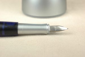
A close-up view of the Pelikan Level 5’s steel nib and section.

If you love constantly changing ink colors, as so many of us do, it is nearly impossible to clean these pens out without completely disassembling the pen, which it was never really designed for. I have yet to verify this, but rumor has it that Pelikan only made blue and black inks for this pen, anyway.

In the final breakdown, I love this pen and filling system for my curio cabinet of horrors. However, the one I own certainly doesn’t live up the to practical writing capacity and flawless functionality I have come to trust and love in the overall Pelikan brand.

Don’t Get Fooled By Fake Montblancs: JFK

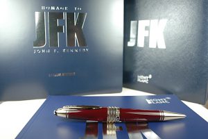
This is an authentic Mont Blanc JFK ballpoint pen with its original boxes and papers.

In an effort to pay tribute to the United States of America’s youthful, idealist president who was assassinated, the Montblanc JFK is a special edition pen. It is a handsome pen that came in several color combinations and was most sought by American historians and fans of the late president.

As with all popular Mont Blanc pens, the fakers jumped on the design as quickly as they could, and many of their replica pens make for very convincing copies. So far, we have only carried 2 authentic ballpoint versions of the Montblanc JFK. However, we recently picked up 4 fairly convincing fakes.

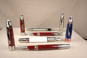
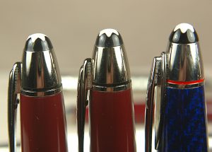
These fakes include 3 fountain pens and 1 rollerball pen. The burgundy models are especially realistic when compared with the ballpoint version above that is authentic.

Four fake Montblanc JFK pens are illustrated in this photo. The burgundy models look especially convincing at first glance.

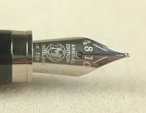
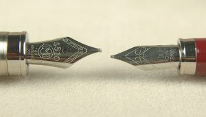
As always, it is the closer inspection that reveals what is real. Luckily for authentic Montblanc collectors, these JFK fakes are easy to spot at a glance. We have never had one of the authentic fountain pens, but those pens have a rhodium plated 14k gold nib with the 1969 moon lander etched into them. None of these fakes have that design. Only one has a convincing standard MB etching, another has a really bad etching that at least mentions Montblanc. The third doesn’t even make an effort. Seriously, it looks as if it woke up hungover on Sunday morning, completely disheveled with a cigarette hanging out of its mouth. Don’t even get in its way until it has some coffee.


You know it is a fake when all of the pens have the same serial number.

Another easy tell on these pens is that they have the same serial number: MBCF 5RS85.

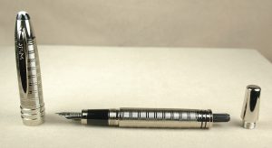
Another dead give away is the filling system. Real Montblancs employ their piston filler system. These fakes get a little credit for having a tail piece that unscrews, but inside is a removable standard international converter. The real tail units screw in and out but don’t come off. They just manipulate the internal piston.

Construction of the pens also plays a part. The fakes tend to be squeaky when the caps or tail ends are screwed and unscrewed. There also is a strange looseness to those parts. Montblanc threading is far more precise.

Posted below are additional images of the nibs and filling system found on the fake Montblanc JFK pens. Please feel free to add your own comments and observations. Thank you for reading.

This is the fake Montblanc nib that makes a little effort.

These are the best and the worst of the fake MB nibs.


This photo illustrates the fake Montblanc’s filling system. Real JFK pens don’t use cartridge/converter systems.

Resurrecting Vintage Pen Brands

When I first started ThePenMarket.com, I also worked part-time at a brick-and-mortar pen shop in a mall. I was far more familiar with vintage pens than modern, and I was very excited to see that the Conklin Pen Company had been brought back to life at around the same time.

I had no idea who was behind the new Conklin, but I was thrilled to see the return of newer and bigger Crescent pens that were much more comfortable to hold and use than the often tiny originals.

Lo and behold, roughly 20 years later, a Facebook post brought me in contact with not only the genius behind the resurrection of Conklin, BUT also Esterbrook, LeBoeuf and the ubiquitous pen of office workers everywhere in the 1990s—Sensa! He also was a founding member of the major American pen distributor called Kenro Industries in 1993!

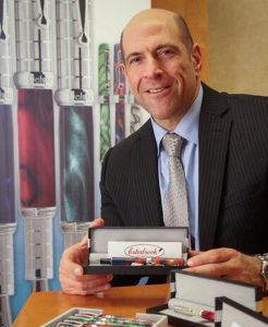
Robert Rosenberg is the inspired entrepreneur who has resurrected the vintage pen brands of Conklin, Esterbrook, LeBoeuf and the modern brand Sensa!

His name is Robert Rosenberg, and he has kindly agreed to talk with us here at ThePenMarket.com to tell us a little about his adventure in pens and his products moving forward.

ThePenMarket: Welcome to our Drippy Musings! It is an honor to be able to talk with you about your impressive successes bringing back beloved pen brands of yesteryear. Please tell us a little about how you got into pens.

Robert Rosenberg: My father was in pens. I grew up in the pen industry. When I was a little boy, my grandfather became the exclusive U.S. distributor of Pilot pens. My father joined him. At the time, Pilot had only one pen: the Razor Point. It became a great success. [Pilot eventually broke their distribution contract, and his dad worked out a deal where he remained a consultant and helped establish Pilot as a much larger company in the U.S. His father also was the first to help bring Sailor pens to the U.S. in the early 1980s] 

My father was now in the pen industry, and he formed another company to distribute Waterman pens in the U.S. [At the time Waterman was an independently owned French company, not a part of Newell-Rubbermaid, as it is today.] After their initial success, Waterman then tried to set up its own company in the U.S. and Dad became the president of that subsidiary in the United States in 1986. 

TPM: Did you have any interest in vintage pens brands when you were younger? 

RR: My father and I used to go to flea markets as a kid. We’d go to flea markets to look for old Waterman pens. We bought a lot of them.

TPM: How did you come up with the idea to first bring back Conklin?

RR: I was very familiar with the pen business when I decided to go to law school. I took a course about trademarks. And it taught the law regarding what you do with abandoned trademarks. I wondered if there were any pen brands that fell off the face of the earth. I did the research, and I found Conklin.

TPM: How do you bring back a dead company? Do you have to pay someone for the rights to it? Who would you even pay?

RR: In trademark law, if there is brand that is no longer around any more and a certain amount of time has passed, you can file a trademark application with the U.S. Patent and Trademark office. It is a long process and it doesn’t always work. It isn’t easy, but I was able to acquire the rights to Conklin. 

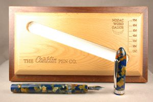
This modern Conklin Nozac was one of the very first pens Rosenberg released with help from Visconti.

TPM: I love how you redeveloped a successful Nozac filler and the Crescent filler. I, honestly, think that was the key Conklin’s incredible success. How did you manage to go retro when the world was locked into cartridge and converters?

RR: That was probably the smartest thing I did, and it was not totally my idea. I worked with Dante Del Vecchio at Visconti. He was very eager to work with me. We worked out a deal and he made it for us. 

TPM: With Conklin seemingly really roaring along, why did you sell the company?

RR: I didn’t want to sell the company. My father had come on as a partner. And we ran it; we built it. Then one morning I found him at my desk. He had a brain hemorrhage and passed away. We sold it to YAFA due to estate issues that arose from my father’s passing.

TPM: In 2015, you breathed fresh life into Esterbrook. What inspired you to go back and revive that brand?

RR: I had been looking at that brand for a number of years. It was still trademarked by somebody, and I was keeping my eye on it for a long time. Eventually the trademark had been cancelled. I wasn’t even aware of how big the history of the company was. I think I made some missteps in the beginning. We had some backlash from the pen community. [The pen community wanted the return of its J-model pens from the early ’50s and the original replaceable screw-in Esterbrook nibs. But, as Mr. Rosenberg pointed out, even if Esterbrook had not gone out of business, they wouldn’t be still making pens just as they did 70 years ago.] We did have some nice pens. I had worked with Kenro for a year really getting Esterbrook running, again, and then I eventually sold it to them.

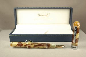
The Conklin Mark Twain was the first really big hit Rosenberg’s resurrection of Conklin had. It was based on the original pen from the late 19th century. The old company had paid the author Mark Twain to be its first spokesman.

TPM: Clearly, you weren’t done, yet, bringing back the iconic LeBoeuf in 2019. How did that come about. Unlike the other two brands, which had died out decades earlier, hadn’t there already been an attempt to bring back LeBoeuf in the 1980s or ’90s? I have one of their “Greg Norman” pens on my website.

RR: Yes. They did a horrible job. I remember when LeBoeuf was brought back. I shook my head at the time, and I didn’t understand what they were doing. They had nice boxes, but that was it.

At the time I also got Sensa. After the company’s roaring success in the 1990s, Newell-Rubbermaid had bought it for $25 million. The reason that they bought it was for the patents on the grips. It never worked out for them, and they just dropped it and let it go. It is crazy. They had a huge following. We still get calls from people to replace their grips. [The original Sensa Plasmium grips started decomposing, leaking and getting sticky.] 

The grips are very tricky to make. We spent a lot of time to get the Plasmium grip just right so it won’t have those problems as before. However, we had to redesign the pen to make these new grips work better, which is why we can’t replace the grips on the old pens.

TPM: For readers who don’t know this, LeBoeuf was founded in 1919 in Springfield, Mass. It was the very first pen company to manufacture fountain pens made of celluloid. Robert, you’ve brought back some beautiful recreations of some of those early designs in modern acrylic pens. Are there plans to keep bringing back more of those stunning early designs?

RR: Yes. The thing with LeBoeuf is that they didn’t have a lot of different models. They had a brief history. They had this Pilgrim, and we are going to continue with that. We do have some other designs and productions. We’ve sort of made a name for ourselves with our limited editions. We just came out with a Winston Churchill this week, and we’ve almost already sold out of it. We’ve got new releases planned through 2025. People have really gotten into the limited editions and themes. Edgar Allen Poe was probably our best seller. Next month we have a Herman Melville. It is a nice business model.

TPM: Given how vintage filling systems really seemed to be key to the success of reviving Conklin, is there any hope for the classic sleeve fillers once used by LeBoeuf? In truth they were basically very simple aerometric fillers under the sleeve.

RR: We’re trying. We’re working on some designs now. We do have some other vintage inspired pens that we are working on. They will be out in 2024.

TPM: How about a solid-gold nib?

RR: We tend to have stayed away from the gold because of the pricing.

TPM: What can we pen devotees expect from you in the future?

RR: We are working on a new Sensa fountain pen. I think it will be more acceptable to fountain pen users.

TPM: Thank you so much for taking the time to talk with us today! Best of luck in all of your inky endeavors. To see more about modern LeBoeuf or Sensa, please go to their websites:

LeBoeuf

Sensa

Loose Ends Ink Test

While wrapping up our ink tests in 2021, we had a bunch of loose bottles of ink that we tested on the same pieces of Rhodia paper to save paper and space. I left these test samples in the window for six months, and Dawn and I calibrated and tested the pH on these samples at 75.6-degrees Fahrenheit and 50% humidity.

Check out how UV light effected our hodge-podge selection of ink by Sheaffer, DeAtramentis, Iroshizuku, Monteverde and Waterman

As always, we found the results interesting. However, these results are simply raw data. How the chemistry of the inks reacts to the chemistry of a pen’s ink sac or converter is not necessarily dictated by the pH level of the ink. For example: You’ll see below that Waterman Serenity Blue is very acidic with a pH at 2.7, but we’ve used it in vintage pens for years without it doing anything other than standard wear on ink sacs over 5 to 10 or more years. Many dealers other than myself find Waterman inks to be a gold standard of safety for use in vintage pens.

You can see in the photo that most of the ink fared poorly in the light-fast UV test. The Sheaffer inks were the Czech Republic-made variety in blue-black, blue and purple. Their colors are quite pretty when freshly dried. UV light makes the blue-black a faded black and grey. Blue fades badly to a blue-black, and the purple almost complete disappears!

De Atramentis Black Rose holds up reasonably well, though it fades a little. Red Rose fades by about 50%.

We had 2 leftover Iroshizuku inks. The green Fukurokuju is a lovely Irish mint of a color, but it fades really badly in UV light. I’m also a fan of the medium-grey Fuyu Syogun, which has hints of purple and blue. Unfortunately, it fades to almost invisible.

Up next were our first looks at bottled Monteverde ink. Blue Horizon and California Teal are both gorgeous. If you lay it down too wet, it has some nice sheening. Yet, the blue faded to purple and the teal turned grey! Monteverde Black faded heavily to a reddish-grey. Amazingly, Mandarin orange held its color really well. Napa Burgundy faded a bit but generally held its color better than most of the other Monteverde inks.

Last but not least was Waterman’s Serenity Blue. Just about every expert I know insists it is the same formula as Waterman’s Florida Blue, but I swear I see a change. Unfortunately, it behaves much like the old Florida Blue by fading pretty drastically in the sun.

Please look below for the pH readings on all of our inks tested. As a quick refresher, 0 to 6.9 is on the acid side of the scale, with 0 being the extremely corrosive end of the scale. 7 is pH neutral, like pure water. 7.1 to 14 is alkali or base, with 14 being the extremely corrosive side of that half of the scale. Again, our pH results don’t guarantee that the ink is corrosive in your pen, as the chemistry of the ink might mix differently with the chemistry of your ink sac or converters.

SHEAFFER:
Blue-Black                    4.5
Blue                                3.6
Purple                            5.1

IROSHIZUKU
Fukurokuju                   8.7
Fuyu Syogun                 9.6

MONTEVERDE
Horizon Blue                6.5
California Teal              7.4
Black                               4.4
Mandarin                       7.7
Napa Burgundy            6.9

WATERMAN
Serenity Blue                 2.7

Grab Some Popcorn: It’s Podcast Time

Since moving to Connecticut, I’ve befriended the artist and painter Jonathan Weinberg, who also happens to be the founder of the Charter Oak Pen Club and curator at The Maurice Sendak Foundation. (Yep, that Maurice Sendak who wrote “Where the Wild Things Are.”)

This week, he invited me on to his podcast, “Drawing with Fountain Pens.” It is a fun show in which he explores his passion for pens, ink and drawing. In this episode, he interviews me and we discuss some of my favorite pens and how I got into the hobby and business of vintage pens and modern pens.

I hope you like our discussion. If you do, please be sure to subscribe to his podcast. Thanks!

To see some of his artwork, check out jonathanweinberg.com.

A Nib by Any Other Number…Is Still Confusing

Even for experienced professionals, it is really difficult to gauge a nib by its number. We get calls and e-mail with some regularity asking for a nib of a certain number. The trouble is, we often aren’t sure what the customer really wants. If the nib brand isn’t specified it can be a really challenging to know what is really desired.

A number on a nib doesn’t always mean what it seems to mean. Here a #4 is larger than a #5.

Take this 14k gold Conklin #4 and 14k gold Sheaffer #5 for example. It is often assumed that nibs always followed a standardized system of sizing. After all, that would make the most sense. Unfortunately, especially in the golden era of vintage pens, many of the companies sized their own brands differently from their competitors. The only thing that seems uniform is that within each brand a #0 or #1 nib was the smallest and the sizes could go up to 12 or higher, though many seemed to top out around 8. Here you have a Conklin #4 being larger than a Sheaffer #5.

The closest to a standard setter in the 1920s and ’30s might have been “Warranted” nibs. These were usually 14k gold nibs that were used by a wide variety of 2nd tier pen brands and repairmen looking to get a pen up-and-running, again, if they didn’t have the proper branded nib. In some ways, these were the JoWo or Bock nibs of their time.

Nib sizes vary widely by brand in this photo.

Check out these nibs lined up together. From left to right: Sheaffer Feather Touch #5; Sheaffer 3-25; Waterman 2A; Unbranded #2; Mabie Todd #2; Star PE #6 and Diamond Medal #5. Note their lengths and widths in relation to their numbers and each other.

To size a nib properly, especially if it isn’t a branded nib, it is important to measure the nib. To do that, let’s discuss the anatomy of a nib. Let us start with the writing tip, which usually has a special tipping material to keep the nib from deforming with a lot of writing. The tip grows into the two (or three for music nibs) tines. The breather hole allows for the exchange of air and ink inside the pen, helping to facilitate ink flow. Usually the breather hole is centered at the widest part of the nib known as its shoulders. As the nib tapers down to its tail, that part is known as the body of the nib.

Here are 3 more numbered nibs muddying the waters of size referencing. The 6 is a little bigger than the 3, but it is definitely smaller than a JoWo 6, which I didn’t have in time for this article.

If you are looking for a good replacement nib, measure the length of your nib from tip to tail. (It is easier in centimeters and milimeters than 32nds and 64ths.) Then measure the shoulder. These two measurements will get you pretty close. Probably close enough in 90% of cases. Yet there is one last  bit to account for, which is the width of the gold. As the technology improved nibs got stamped thinner and thinner. It is easy to feel the difference between a 1920s Sheaffer Lifetime and a 1950s Sheaffer Snorkel nib of open design.

This brings us to some of the more confusing numbers on nibs. Earlier you saw a photo of a Sheaffer 3-25 nib. Although most 3-25 nibs are the same general size, that number referenced the price and warranty length of the pen from the date it was purchased: $3 and 25 years. You might also see Sheaffer 5-30 and 7-30 nibs. If you ever find a 7-30 nib, snatch it up. Those are pretty rare. It was a clever marketing tactic by Sheaffer. For an extra dollar, you got the Lifetime warranty pen. If someone back then could already afford the $7, they could afford $8. Yet, how many people really used their Lifetime pens for 30 years or more? That is a question I would love to know the answer to. I’m sure a few did, but, for many, pens were a fashion accessory and statement, as well as a useful tool.

Sheaffer Lifetime pens of the 1920s and ’30s had elaborate serial numbers, which had for more to do with fighting black-market pen dealing than tracking customer pens.

Showcasing the 1950s Sheaffer numbering system are two more nibs. M1 = Medium Steel Open Nib and F5 = Fine-Point, Two-Tone 14k gold Triumph Nib.

In the 1950s Sheaffer started an alphanumeric nib classification system, which was really quite inspired and gave a great deal of information about the nib. The first letter of the code was the point style: A = accountant (extra, extra razor-thin fine); B = Broad; F = Fine; G = Gregg Shorthand; M = Medium; S = Stub and X = Extra Fine. On hyper-rare occasions there could be two starting letters led by an F for flexible such as an FB5, as you will soon read.

The numbers that followed the first letter were: 1 = Steel Open Nib; 2 = Monotone 14k Gold Open Nib; 3 = Two-Tone 14k Gold Open Nib; 4 = Palladium Silver Triumph (conical) Nib; 5 = Two-Tone 14k Gold Triumph Nib and 6 = Palladium Silver Open Nib. And for those keeping score at home, the two-tone nibs were solid 14k gold with a decorative Palladium plating over about half the nib.

On rare occasions there was another letter that followed the number: L = Left Oblique and R = Right Oblique.

And there you have it. At the very least it is a start to understanding the numbers we see on nibs and what they might mean. I hope you found it to be helpful.