Launching New Pens’ Site!

We’ve done it! ThePenMarket.com is now a fully licensed and authorized dealer of Lamy and Yard-O-Led writing instruments!

When we first launched this business, we figured we’d have a complete assortment of every brand-new modern pen available on the market within 6 months. We also didn’t know jack about anything. Yet, after 7 years of hard but fun work, we are proud to finally deliver on that promise of new pens.
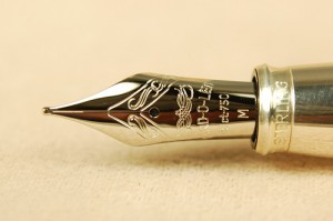
This is the incredible 18k white gold nib from the Yard-O-Led Astoria. It is one of many great NEW pens you will find on our New Pens pages, now that we are an authorized dealer for Lamy and Yard-O-Led.

This is the incredible 18k white gold nib from the Yard-O-Led Astoria. It is one of many great NEW pens you will find on our New Pens pages, now that we are an authorized dealer for Lamy and Yard-O-Led.

If you wonder why we have been so quiet on the blog for the past several months, this is why. We were just way too busy working behind the scenes getting the new pens ready with help from our wonderful friends at Computer Friendly Associates.

Enough, with the small talk, come take a tour of the New Pens section with us. Click that New Pens link in the last sentence. It should open up a new tab showcasing the new section.

To go exploring just click whichever brand you prefer: Lamy or Yard-O-Led. This will show you all of the models presently available for sale. If you clicked Lamy, you will see the Safari and the Al-Star! We will be adding more soon, but we wanted to open this to you now so you can play around in it to see what you think and to get your feedback.

Let’s say you are interested in the Safari. Below the main image you will see tabs for the different styles the Safari comes in: Fountain Pen, Rollerball, Ballpoint and Pencil.

Click the Fountain Pen, and you will see all of the colors and nib options available. Unlike any other dealership, we gladly offer 11 different style Lamy nibs that fit the Safari–including the calligraphy 1.1mm through 1.9mm nibs normally reserved for the “Joy” pen by Lamy!

Why Lamy and Yard-O-Led?

Lamy is a fantastic brand that makes really good, really affordable fountain pens for any skill-level of fountain pen user. Their terrific German engineering makes them durable for any adventure you go on, and their nibs are so smooth and reliable.

Yard-O-Led is a writing instrument company in England that specializes in luxury pens not frequently found here in the United States. Their pens and pencils are made of sterling silver and are true works of art. They are damn good writers, too. I think if American pen users were more familiar with them, they would switch their allegiances from Mont Blanc to Yard-O-Led in a hurry.

Well, have fun exploring the new section of the site, and rest assured more pens are coming! In the meantime, please let us know what you think about the new section and how it works for you.

Yard-O-Led Ink Review

It isn’t often we get to see Yard-O-Led inks on this side of the puddle. Luckily for all, ThePenMarket.com now carries these fine bottled inks.

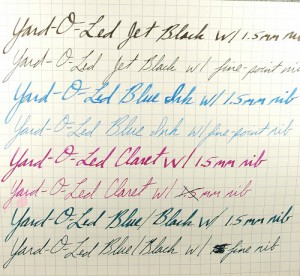
Check out the new bottled ink we carry. Yard-O-Led inks come in four colors: Jet Black, Blue, Blue/Black and Claret. Look closely to see great shading in the Jet Black and Blue/Black. The Blue and Claret are radiant wonders that are treat with which to write.

Check out the new bottled ink we carry. Yard-O-Led inks come in four colors: Jet Black, Blue, Blue/Black and Claret. Look closely to see great shading in the Jet Black and Blue/Black. The Blue and Claret are radiant wonders that are treat with which to write.

What struck me first about these inks were the radiance of the Blue (Royal Blue) and Claret (Fuchsia) inks. The blue is a washable ink and very bright. As I have only had it for a short time, I’m not sure how much it will fade over time, as many washable blues do. Nevertheless, I am enjoying its fresh blueness.

The Claret ink seems to be lively combination of hot pink, purple and red. While I expected it to be more of a rich, red wine color, I think it be very popular among the teenage girls who want to explore fountain pens with a more feminine color ink.

Traditional ink lovers will get a charge out of the beautiful shading delivered by the Jet Black and Blue/Black inks by Yard-O-Led. The Jet Black is more of a charcoal grey, and the wider the nib you use, the more distinctive the shadows become. The same can be said for the Blue/Black ink. Fine-point nibs lose the shading and concentrate the colors more.

Improve Your Handwriting Today

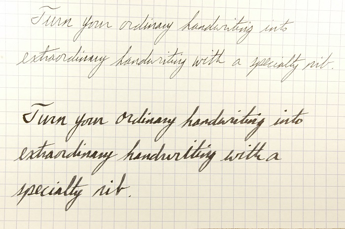
See the difference a 1.5mm Lamy nib can make for your handwriting. Not only do the letters take on more distinctive shapes, the ink, itself, provides shadows and highlights on every letter. It is far more interesting than a boring old fine-point nib.

See the difference a 1.5mm Lamy nib can make for your handwriting? Not only do the letters take on more distinctive shapes, the ink, itself, provides shadows and highlights on every letter. It is far more interesting than a boring old fine-point nib.

It should be noted that my handwriting is terrible. Some of my friends who almost never write anything by hand think it is amazing simply because I can still do it. No writing expert on earth would praise it. However, with a with a nice broad stub nib, it looks much more exotic and fascinating.

You, too, can impress some of the people some of the time with a few simple handwriting tricks I have picked up over the years.

Unless you already have beautiful penmanship, I recommend staying away from those extra-fine nibs that are so in vogue today. Relax and let your handwriting out a bit to breathe.

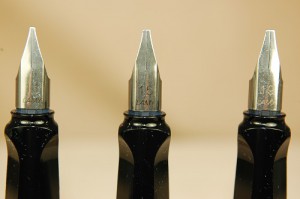
Lamy calligraphy nibs range in size from 1.1mm to 1.9mm. Each provides a distinctive nuance to you handwriting. The Lamy Joy fountain pen set is a great way to try all three sizes for fewer than $70.

Lamy calligraphy nibs range in size from 1.1mm to 1.9mm. Each provides a distinctive nuance to you handwriting. The Lamy Joy fountain pen set is a great way to try all three sizes for fewer than $70.

Trick #1 to Handwriting Coolness: A stub nib. We now carry brand-new Lamy Joy calligraphy sets that feature three nibs: a 1.1mm nib, 1.5mm nib and a 1.9mm nib. These super-smooth broad flat steel nibs can create some wicked curves, lines and angles in your natural handwriting.

Trick #2 to Handwriting Coolness: Slow down.

Trick #3 to Handwriting Coolness: Think about what you are doing. When using a stub nib, the angle at which you write becomes crucial to developing richer characters. Experiment with ways to use the flat edge sideways for skinny lines and the flat edge of the nib vertically for thick lines. Watch as you practice O’s for how the circle should grow from skinny to fat and skinny again. See what happens when you try to grip your pen in one set position and write with your arm instead of your fingers and wrist. By setting the wrist, you can make more dynamic letters.

Trick #4 to Handwriting Coolness: Ink. If you think all inks are the same, think again. Most bottled inks are inconsistent, especially when using a stub nib. Very few blacks are true blacks, and many blues and blue-blacks are also inconsistent.

For example: Yard-O-Led Jet Black is really a charcoal grey. With a 1.5mm nib, the inconsistency is obvious, as the ink goes from black to grey in places. This gives your writing a fascinating texture and appeal. Pelikan and Cross (Okay, these two inks are exactly the same because they are made and bottled by Pelikan.) Royal Blue ink also has many inconsistent colorings when written with any medium nib or larger. Just keep in mind that Pelikan Royal Blue also fades heavily with time. It might not be ideal for your archiving projects.

I hope this helps set you on the write…oops…right path to improving your handwriting and developing a fascinating new look to your correspondence.

Yes, yes. It is a shameless plug, but I really do hope you consider buying one of our Lamy Joy sets because they really will introduce you (or a loved one) to several great stub nib variations that write well for a very affordable price under $70. The sets not only come with three nibs, but ink cartridges and an instruction manual with advice about making the most of the nibs. It is even packaged in a handy collector’s tin.

If you really want to get all fancy-shmancy, try our rare Mont Blanc Generations fountain pen with a 14k stub nib for only $99.99.

A Brief History of Cursive Writing

Since letters have been invented, people have looked for ways to write them more swiftly. Scribes writing on clay tablets developed a more fluid form of writing that served as an early cursive in Mesopotamia.

The cursive writing we recognize today started developing in Europe the 16th century. Connecting letters with loops and tails seemed to grow increasingly more uniform across languages as education became more available to the citizens of those nations. Instruction was made more simply by the invention of textbooks printed using a special copper plate. Students could trace the preprinted letters with their quill pens. The resulting form of writing was simply referred to as copperplate.

For a great example of copperplate writing, look no further than the U.S. Constitution.

Copperplate served as both a simple, functional script and as something that could be made to look fancy for special ceremonial papers. As literacy was far from universal, and the need for legible handwriting was great, copperplate writing was considered something of an art form to be seriously studied. Reading and writing was no small task in the 17th, 18th and 19th centuries. Penmanship was critical.

The many forms of cursive writing in the centuries to follow evolved out of copperplate. Around 1840, a man named Platt Rogers Spencer believed it was important to make handwriting a true art form unlike those attempts that preceded him. A master craftsman in the art of handwriting Mr. Spencer developed his own variation of cursive that required dedicated training and skill to master its swirls and embellishments. The Spencerian method became the official writing style of government and corporate documents from around 1850 to 1925. Whole schools and textbooks were developed to teach this writing style around the country. The need for the super-flexible nibs most vintage pen collectors refer to today as “wet noodles” were essential for the modulating lines of Spencerian script that grew from extra fine to double and triple broad to accentuate a circle and add weight to the elements of each letter’s formation.

Today you can still see great examples of Spencerian script in classic century-old American brands such as Ford’s and Coca-Cola’s logos.

As elegant and beautiful as Spencerian script was, it was also time consuming and difficult to master. American business in the 19th century moved at a surprisingly fast clip by even today’s standards, and the Spencer method of writing was too slow for the needs of offices around the country. To keep up with the newly invented typewriter, secretaries, stenographers and many other white-collar workers needed a faster way to write.

In 1888, Austin Norman Palmer came to the rescue with his own method of writing. What became known as the Palmer Method caught on quickly for its legibility and ease of use. Most of the cursive writing we learned in school is, or was, based on the Palmer method.

Although Palmer method textbooks ceased publication in 1980, the very similar Zaner-Bloser method of cursive writing remains popular to this day. Developed in 1891, the Zaner-Bloser school realized the value in becoming a powerhouse in textbook publication for their handwriting and remain one of the top sources of handwriting instruction in schools across the country to this day.

In 1978, the D’Nealian handwriting method tried to breakdown the Palmer method into simpler steps to teach little kids how to write in cursive. It too remains popular, although my quick imperfect research into this piece seems to have found that the Zaner-Bloser method seems to dominate what is left of the industry to teach our youngsters how to write in cursive.

For much more detailed information about the history of handwriting and to learn how to master copperplate, Spencerian script, the Palmer Method and other forms of handwriting, visit The International Association of Master Penmen, Engravers and Teachers of Handwriting. The IAMPETH is an incredible resource for all of your handwriting needs.

Click here to be linked to their website: http://www.iampeth.com/.

Coming soon: Quick Tips for Taking Your Handwriting to the Next Level

Is Cursive Writing Going Extinct?

As we ponder the start of a new school year, did you know most schools are no longer teaching children how to write in cursive? This fact first came to my attention by friends, who are parents, telling me their kids aren’t learning cursive. Recent documentaries that address the phenomenon have also been brought to my attention.

Without wanting to launch rants from across the political spectrum, it turns out many states had been opting to forego cursive instruction for third graders and up for several years. The Common Core standards picked up that trend. Now children are only expected to learn how to print in kindergarten and the first grade.

After first grade, it is expected that kids are going to be using keyboards for the remainder of their natural lives. I suppose this is not an unrealistic assumption given how most kids and teenagers (and adults) seem glued to their tablets, smart phones and computers.

Nevertheless, this is something I find highly disturbing…and not just because I am a purveyor of fine antique writing instruments.

How will children develop their fine motor skills? How will kids learn how to think, without constant distraction and temptation from their electronic devices? How will future generations do something as simple as signing their name on a contract? (Will they only be able to print their names with the motor skills of an overgrown 6-year-old on a mortgage or a multimillion dollar business deal?) What about future historians? Most of human history was recorded on paper, often in handwriting. Or what about simply generations of families trying to get in touch with their ancestors. How will they read the letters, Bibles and other records of past generations?

“Oh, wow. Look at all these letters Great Granddad sent Great Grandma during World War II! I wonder what they say? Who can read that crazy scribbling? Why didn’t Great Granddad just e-mail from the Ardennes?”

While I strongly believe in teaching kids how to master computers at a young age, I don’t know why a computer should be their only means of note taking. Let’s be honest, if you give a bored kid an internet-connected computer device and expect them to pay strict attention and take notes during a lecture, you’re living in a fool’s paradise.

If you are like me and think it is important that we teach our kids cursive writing, we are not alone. There is even a website dedicated to the pursuit of cursive called “The Campaign for Cursive.” You can check them out at www.cursiveiscool.com.

In the meantime, I’m going to take a more in-depth look at the history of cursive writing and what you can do to either teach it or improve your own handwriting in the next two blog posts.

Stay tuned!

Happy Hunting at the D.C. Pen Show

Hello to the members of the Black Pen Society. I hope this year's pin is as cool as last year's!

Hello to the members of The Black Pen Society. I hope this year’s pin is as cool as last year’s!

This is the thrilling weekend of the D.C. Pen Show, one of the biggest vintage pen shows in the country.

Sadly, we couldn’t be there this weekend, but all of our best goes out to the our friends who are buying and selling at this year’s show.

I’d like to give a special shout out to our friends in the Black Pen Society. You know who you are. Enjoy this year’s “secret” meeting. Sorry I can’t be there. The Illuminati got nothin’ on us.

Pen Ads of World War I

Today, essentially, marks the 100th anniversary of the start of World War I. It is still one of the most savage wars the world has ever known. It left nearly 2% of the world’s population dead: 23 million. There is a good reason those who fought it were called the Lost Generation.

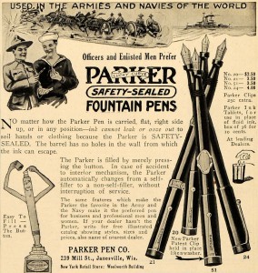
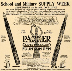
Sealed button-filling pens and take-anywhere ink tablets were revolutionary new creations for sailors and doughboys hoping to write home during the first world war.

Sealed button-filling pens and take-anywhere ink tablets were revolutionary new creations for sailors and doughboys hoping to write home during the first world war.

Yet, there’s no reason wholesale slaughter shouldn’t prevent the tide of marketing.

Parker had a particularly fascinating line of pens aimed directly at servicemen in the trenches. These pre-Duofold pens were considered “sealed” and leak proof. Best of all, you no longer needed fragile glass bottles of ink, which would not withstand the rigors of combat.

Parker sold special ink tablets. These dried tablets could be dropped in a cup of water or any other small container for a nearly instant supply of ink to fill a pen and write your family or sweetheart back home.

These ads come from around 1917, when the United States officially entered the war, which ended Nov. 11, 1918.

Enlist the safety-sealed button filling Parker pens for your needs at school or while fighting in the trenches in this classic WWI Parker ad.

Enlist the safety-sealed button filling Parker pens for your needs at school or while fighting in the trenches in this classic WWI Parker ad.


Please note the artillery is being moved by horses in the ads. This would be the last war to see horses used with any widespread practical regularity. It also would be the last to see swords and lances issued with actual intent for battlefield use. (Yes, the Japanese issued swords in WWII, but they were strictly weapons of last resort.) Cockades and spikes also saw their last use on helmets. Battlefields would be dominated by machine guns and the newly invented tanks. Oceans were devastated by submarines. And for the first time, aircraft could fly over enemy territory to observe movements, attack with machine guns and drop bombs. Cars and trucks came to play vital roles. Motorized ambulances saved countless lives. And chemical warfare would devastate countless people with agonizing pain and misery…if not death.

Getting back to the ads, I love that a pack of more than 30 ink tablets cost only 10 cents. Do any of these tablets still exist? I would love to see some and try one.

Fix Scratchy Nibs

WARNING: The following repair advice can easily mess up your favorite nib if you aren’t careful and experienced.

You think you’ve found the perfect pen at a show, estate sale or antique store. The color is good. The filling system still works. And then you try to write with it. Although the nib looks good, it is a very scratchy writer.

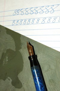
Learn how to fix a scratchy nib with only a little water and some ultra-fine grit sandpaper.

Learn how to fix a scratchy nib with only a little water and some ultra-fine grit sandpaper.

You can fix that scratchy nib with some patience and nerves of steel.

It doesn’t take much effort to ruin or at least alter the width of your nib with the accidental flick of the wrist. DO NOT try this on your favorite pen that has just picked up a hint of a scratch. Get some junkers with which you can build up some experience.

Get to know your nib before you attempt anything. Is it gold? Is it tipped with irridium? Is it a steel nib? Look very closely at the nib. Use a loupe or magnifying glass. Are the tines even? Is the tip bent?

If the tines are slightly misaligned, you can push them back into place with just your thumb nail. Be careful, as misaligned tines often snap very easily. Often, I prefer to raise the lower tine to be even with the upper tine. To do this, push directly up on the single lower tine with your thumb nail to a position just above the other tine. Hold it for a second and then relax it. Check it, and repeat the process as needed. Sometimes, I push the upper tine down. Learning which to redirect really just comes with experience.

If the tip is bent, forget about it. We’ll save that for a different article.

If the tines are even but just scratchy…

Check to see if the tip is gold, gold with a metal (usually irridium) tip or steel. If it is plain gold, which is rare, the sanding process will weardown the nib super quickly. If it is tipped, check to see if the tipping material is still complete. If it isn’t, you’ll need to get it retipped. If the tipping metal is still there, then you will be safer to try to sand the nib into submission. The steel nibs are also pretty safe to try to smooth, although by their nature, they generally won’t smooth as well as the gold nibs. It is rare to find a truely smooth steel nib on a vintage pen, unless it is from the Esterbrook 9000s line.

If you are into freakishly extra-fine nibs, send your pen to a nib expert (and I am not that type of nib expert). If you aren’t so picky as long as you can have a smooth writer…continue reading.

To try to sand the nib into a sweet spot, you will need a small glass of water, a clean sheet of your normal writing paper and some very fine-grit sandpaper. I recommend 2500 grit or finer. You also will want a tissue or paper towel.

Set up on a hard-topped desk or table. A cushioned writing surface will have you putting holes in the sandpaper with the nib and putting odd edges on the nib.

To get started, I like to make sure the pen is full. Then spread a little water on the sandpaper. Next write a figure 8 with the scratchy pen on the watered sandpaper. The water helps to lubricate the sandpaper so that you don’t take off too much from the nib. Your figure 8 should be about the size of your normal letters when writing…maybe a little bigger. Don’t worry about the ink on the sandpaper. And don’t think that the ink will naturally lube the paper enough without water. It won’t.

I like to have the pen full of ink, so I can immediately test the nib on a clean sheet of paper. After your first figure 8, shake the pen in the glass of water and dry off the tip. This just clears the tip of any sand, as you don’t want to keep sanding the nib when you don’t want to sand it. Test the nib on the clean sheet of paper and see how it feels. Patiently repeat one or two 8’s at a time on the sandpaper and repeat the process.

If you find that you need more than a couple figure 8’s, start writing 8’s from different angles, as you don’t want to flatten out the nib in your normal writing position.

If everything is almost perfect but you are still having scratches at the top or bottom of your loops, try to work out those parts of the letter on the sandpaper.

REMEMBER, every time that nib touches the sandpaper, it is going to get wider. Often, it only takes an 8 or two. It is not uncommon for your fine nib to become a medium or a medium a bold nib while trying this repair. If you want to be assured perfection with little change to your nib’s writing characteristics, it is best to find an expert.

Inkwell Pages Fully Updated

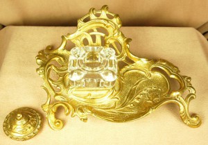
Some inkwells are too beautiful for words. How can they do a better job detailing the beauty of this art nouveau masterpiece.

Some inkwells are too beautiful for words. How can they do a better job detailing the beauty of this art nouveau masterpiece.

For too long we neglected our commitment to finding really nice inkwells and blotters for our customers. It was trickier than we thought it would be to find good ones when we first started this website.

Luckily, we found a delightful cache of them in Atlanta this past spring. From a really old bottle of Waterman’s ink to a luxurious brass art nouveau inkwell, you will find something remarkable to complete the look of your desk on our inkwells and plotters page.

Now we just need to start finding good blotters.

Adding Character with a 1915 Underwood Typewriter

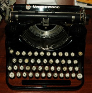
Every wonder what we use on our classic shipping labels? You are looking at our beloved 1915 Underwood portable typewriter. This machine is as dedicated a writer as any of our vintage pens.

Every wonder what we use on our classic shipping labels? You are looking at our beloved 1915 Underwood portable typewriter. This machine is as dedicated a writer as any of our vintage pens.

Several customers have noticed our shipping labels are always typed up on an “old skool” typewriter and have asked after it.

In addition to vintage pens, I have a fetish for classic, old-fashioned typewriters. It is amazing to me how past generations created these incredibly complex machines to type so smoothly.

My typewriter for mailing labels is a 1915 Underwood. The Qwerty keyboard hadn’t been 100% formalized and made uniform when it was made. Some of the keys are out of place with where they are on a modern computer. There is no key for the numeral one. I have to use the lowercase “L”. The ribbon must reversed by hand when it runs out in one direction. The poor thing often veers off on a different direction when trying to type a straight line. It adds lots of personality to the occassional letter that I write upon it. I hope I work as well when I’m 99 years old. If I make it that long, I sure hope I’m in as good a condition!

Believe it or not, I found it in a second hand store with its original portable case for $12. It needed close to $100 of professional restoration work, but it was worth it. If I can’t write with one of my favorite fountain pens, this is my favorite backup.

I cannot restore vintage typewriters, but I hope to learn how one day. They look like a ton of fun to rebuild…because that’s the way I geek out. Maybe one day I’ll show off my electric 1963 Smith-Corona typewriter that is robin’s egg blue and white.