Tag Archives: #inkfasttesting

Examining Noodler’s Ink Part II

For your writing pleasure, we have tested 10 more Noodler’s-brand inks. In Part I we delved into the various controversies, merits and problems with Noodler’s Ink. To read about that, please click on the Part I link.
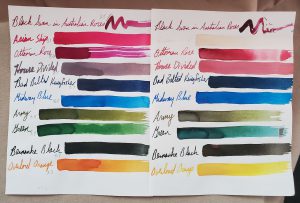
10 Noodler’s inks are on display here as a color-fast testing measure. The sheet on the left has the test proof that was stored in darkoom. The page on the right shows how some of the inks faded after 9 months in the sunlight.

Today’s ink spent 9 months in our sunniest window for a light-fast test. We also tested them for a pH reading, to verify or deny Noodler’s claim that all of its inks are pH neutral.

Let’s start with the color-fast (or light-fast) testing. It is always interesting to see what colors fade. “Black Swan in Australian Roses” is a red-black color that held up really well under prolonged UV exposure–hardly any fading or change in color. “Asian Ship” is a stunning deep pink. Unfortunately, it faded to nearly invisible. “Ottoman Rose” is a lovely purple with dark undertones. However, it fades rather badly in sunlight to a red-brick color, though shaded lines fade almost completely.

Another American Civil War-themed ink is called “House Divided.” It s a gray ink with some blue-ish undertones. On our Rhodia test pad it seemed to be surprisingly feathery. When it set in the sun for 9 months, it faded to a pale reddish pink…a fitting change for an ink based on the bloodshed of the war.

The blue inks we tested are surprisingly strong. “Bad Belted Kingfisher” is a nice dark blue that some might say borders on blue-black. It definitely doesn’t seem to lose an ounce of color. “Midway Blue” is one of the many World War II-themed inks. It is a bright, medium blue, which also doesn’t seem to fade in the sun.

“Army” green has a certain camouflage flair as an earthy yellow-green that is more green than yellow. UV light tends to fade out the yellow parts, leaving behind a darker green.

“Green” is close to an emerald green color at the start. UV light fades out its yellow properties and leaves behind a darker, bluer green.

Ben Bernanke was the chairman of the Federal Reserve for 8 years, overseeing the worst of the Great Recession. The owner of Noodler’s Ink seems rather obsessed with the guy and has, I think, created several Bernanke-themed inks. We tested “Bernanke Black.” It is a nice black when fresh. UV light fades it a bit to brown.

Whereas yellow is what faded out of the green inks above, the red is what fades out of “Overlord Orange,” another WWII ink. After prolonged exposure to the sun, the pumpkin orange fades to a paler yellow.

For those, like me, who haven’t taken high school chemistry in more than 30 years, the pH scale runs from 0 for the most acidic to 14 for the most base/alkali. A 7 is pH neutral, like distilled water. Aside from “Asian Ship,” most of the inks don’t stray especially far from pH neutrality. Here are our results, after we calibrated our testing equipment.

Noodler’s Ink                                  pH Result:
Black Swan in Australian Roses    8.5
Asian Ship                                            3.1
Ottoman Rose                                    8.6
House Divided                                    8.5
Bad Belted Kingfisher                      7.3
Midway Blue                                       8.5
Army                                                     8.4
Green                                                    7.7
Bernanke Black                                  8.7
Overlord Orange                               7.3

Please remember that the pH doesn’t necessarily mean anything with regard to how it will behave in your pen. It is a raw data point. How it will blend with the chemistry of your ink sac, converter plastic and seals is an entirely different matter.

Examining Noodler’s Ink Part 1

The one ink brand everyone is always talking about is Noodler’s Inks. People either love it or hate it. There doesn’t seem to be a lot of middle ground. As such, we want to add our two cents to this conversation, and we surprised ourselves with our tests and findings.

Controversy seems to follow in Noodler’s wake, and, yet, it doesn’t seem to disrupt people’s passion for the ink. From the stains-everything-it-comes-into-contact-with Baystate Blue to clever (and occasionally offensive to some) ink names and label designs, Noodler’s is always a top-selling ink.

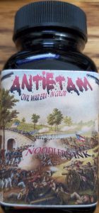
I first got hooked on their ink with “Antietam” ink. As an armchair Civil War historian, I knew Antietam was this single bloodiest day of fighting in all of America’s wars. There were nearly 23,000 casualties at that battle. I got a macabre kick out of the Antietam ink looking like fresh blood when wet and dried blood when dry. It remains my red ink of choice. The ink has never clogged my pens or created any problems.

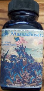
However, my favorite of their ink names is “54th Massachusetts.” As a regiment, it is the most famous African-American regiment of the Civil War. If you’ve seen the movie “Glory,” with Morgan Freeman, Denzel Washington and Matthew Broderick, it is that regiment. The American uniforms in the Civil War were blue. The men of this regiment were black. The ink color is blue-black. A clever ink pun. Unfortunately, as beautiful as the ink is, it clogs the hell out of my pens.

As a matter of fact, virtually every other Noodler’s Ink I have ever written with clogs my pens. As such, the only ink I use is Antietam, and I don’t recommend any other Noodler’s to anyone, unless they are only writing or drawing with dip pens.

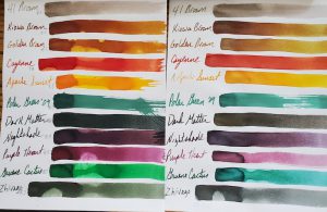
Here are 11 swatches of Noodler’s Ink. The samples on the left were the control samples. The inks on the right were in the sun for 9 months.

Nevertheless, when I bought a large collection of ink several years ago, it came with a large selection of Noodler’s. As such, Dawn and I thought we’d put it to the test. Today’s selection remained in my sunniest window for 9 months. We also pH tested the ink to see how potentially corrosive it might be. As a quick refresher the scale between acid and base runs from 0 through 14, with 7 being neutral, such as pure distilled water. As always, we calibrated our testing equipment before testing the inks.

We were absolutely stunned by how light-fast these colors were. At worst, they lost a little of their luster and vibrancy after 9 months of sunlight. Most didn’t lose anything! Very impressive.

Noodler’s Ink also claims its is pH Neutral. We did not find that to be the case in these 11 inks sampled. However, they were much better regarding pH neutrality than many other brands. The important thing to keep in mind is that just because an ink is pH neutral doesn’t mean it doesn’t have ingredients that will still corrode your rubber ink sacs, diaphragms and seals. We did not test these inks in rubber ink sacs. The pH results below are simply raw data points.

Noodler’s Ink Name     pH

41 Brown                     8.4
Kiowa Brown              8.5
Golden Brown            8.1
Cayenne                      7.8
Apache Sunset           7.5
Polar Green ’09          8.7
Dark Matter                8.6
Nightshade                 8.4
Purple Heart               8.5
Gruene Cactus           8.3
Zhivago                        8.7

In conclusion, these 11 Noodler’s Ink were amazing for their color-fast testing. The pH is a little on the base or alkali side but no where near as far off the mark as many other ink brands.

Loose Ends Ink Test

While wrapping up our ink tests in 2021, we had a bunch of loose bottles of ink that we tested on the same pieces of Rhodia paper to save paper and space. I left these test samples in the window for six months, and Dawn and I calibrated and tested the pH on these samples at 75.6-degrees Fahrenheit and 50% humidity.

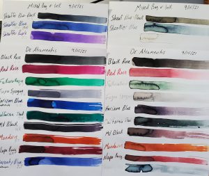
Check out how UV light effected our hodge-podge selection of ink by Sheaffer, DeAtramentis, Iroshizuku, Monteverde and Waterman

As always, we found the results interesting. However, these results are simply raw data. How the chemistry of the inks reacts to the chemistry of a pen’s ink sac or converter is not necessarily dictated by the pH level of the ink. For example: You’ll see below that Waterman Serenity Blue is very acidic with a pH at 2.7, but we’ve used it in vintage pens for years without it doing anything other than standard wear on ink sacs over 5 to 10 or more years. Many dealers other than myself find Waterman inks to be a gold standard of safety for use in vintage pens.

You can see in the photo that most of the ink fared poorly in the light-fast UV test. The Sheaffer inks were the Czech Republic-made variety in blue-black, blue and purple. Their colors are quite pretty when freshly dried. UV light makes the blue-black a faded black and grey. Blue fades badly to a blue-black, and the purple almost complete disappears!

De Atramentis Black Rose holds up reasonably well, though it fades a little. Red Rose fades by about 50%.

We had 2 leftover Iroshizuku inks. The green Fukurokuju is a lovely Irish mint of a color, but it fades really badly in UV light. I’m also a fan of the medium-grey Fuyu Syogun, which has hints of purple and blue. Unfortunately, it fades to almost invisible.

Up next were our first looks at bottled Monteverde ink. Blue Horizon and California Teal are both gorgeous. If you lay it down too wet, it has some nice sheening. Yet, the blue faded to purple and the teal turned grey! Monteverde Black faded heavily to a reddish-grey. Amazingly, Mandarin orange held its color really well. Napa Burgundy faded a bit but generally held its color better than most of the other Monteverde inks.

Last but not least was Waterman’s Serenity Blue. Just about every expert I know insists it is the same formula as Waterman’s Florida Blue, but I swear I see a change. Unfortunately, it behaves much like the old Florida Blue by fading pretty drastically in the sun.

Please look below for the pH readings on all of our inks tested. As a quick refresher, 0 to 6.9 is on the acid side of the scale, with 0 being the extremely corrosive end of the scale. 7 is pH neutral, like pure water. 7.1 to 14 is alkali or base, with 14 being the extremely corrosive side of that half of the scale. Again, our pH results don’t guarantee that the ink is corrosive in your pen, as the chemistry of the ink might mix differently with the chemistry of your ink sac or converters.

SHEAFFER:
Blue-Black                    4.5
Blue                                3.6
Purple                            5.1

IROSHIZUKU
Fukurokuju                   8.7
Fuyu Syogun                 9.6

MONTEVERDE
Horizon Blue                6.5
California Teal              7.4
Black                               4.4
Mandarin                       7.7
Napa Burgundy            6.9

WATERMAN
Serenity Blue                 2.7

Caran D’Ache Chromatics Face the UV-pH Challenge

Swiss pen maker Caran D’Ache is most famous for its precision engineering on its line of ballpoint pens. They make nice fountain pens, too, but it is the company’s ballpoints that the world knows best. Yet, as so many pen makers now do, it also decided to enter the lucrative fountain pen ink market.

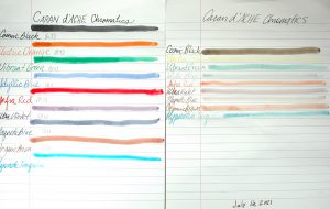
Here is a side-by-side comparison of Caran D’Ache Chromatic inks before and after undergoing 3 months of UV sunlight testing.

Caran D’Ache Chromatic Inks are a daring entry, indeed. From their hexagonal bottles that tip to fill to the last drop to their bright and cheery colors, Chromatics made an instant splash on the scene.

Naturally, we wanted to know how well these inks hold up to UV light from the sun and where they register on the scale of a pH test. We placed this sample in our sunniest window for 3 months. We also used our pH meter, which was calibrated to the heat and temperature of our testing station before testing the inks.

The results of our test were surprising. I falsely suspected that there might be some heavier pigmentation in the “Chromatic” inks that would make them shine and dazzle a bit on the page. However, virtually all of the ink colors lost seemingly 85 to 90% of their color, fading heavily from view. “Electric Orange” all but disappeared. Even a stalwart color such as “Cosmic Black” faded to a medium brown, and it had the most staying power.

The pH test results ranged all over the map. As a quick refresher on chemistry, a pH number of 7 is pH neutral like pure water. The closer to 0 something becomes the more acidic it is. The closer to 14 it goes, the more alkali or base something is. In theory, you want an ink that is pH neutral, BUT we have no idea how the chemicals in each ink will react to the chemicals of the ink sacs, converters, inkfeeds and the like. We have found some “neutral” inks to eat through ink sacs rapidly, while some seemingly alkali or acidic inks don’t bother a pen’s parts at all. The following is simply raw data for you to do with as you please.

COLOR:                              pH Score:
Cosmic Black                      6.9
Electric Orange                  8.9
Vibrant Green                     4.4
Idyllic Blue                          3.1
Infra Red                             8.2
Ultra Violet                         7.6
Magnetic Blue                    3.7
Organic Brown                   4.5
Hypnotic Turquoise         N/A

A few of the things that stand out to us are that Cosmic Black is almost perfectly neutral. Aligning with more of our past experiments, the blues were fairly acidic. Yet, playing against stereotype, the red and purple were closer to neutral. Green remains quite acidic, which is expected, but the brown also was acidic, which wasn’t expected.

As always, I hope you found this snippet of ink data helpful to your quest for the perfect ink for you.

Iroshizuku Ink Gets UV & pH Tested

No one should be surprised by the meteoric rise of Iroshizuku inks on the fountain pen scene. Japan’s finest ink makers have created dozens of colors and hues that offer vibrancy and shadowing while never clogging a vintage or modern fountain pen.

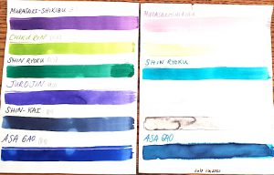
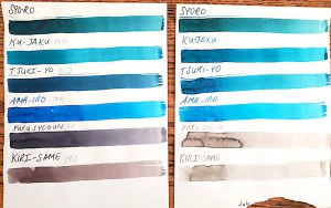
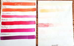
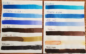
We picked up 24 bottles of this amazing ink and have submitted them to our rigorous UV and pH testing. Each of the following inks was placed in one my sunniest windows between July 16, 2021 and October 16, 2021. We calibrated our pH meter and tested these inks at 75.6ºF at 50% humidity. As a quick reminder, on a pH test, 0 is the extreme limit for acidic, 7 is neutral and 14 is the extreme end of alkali or base. Click the individual photos for a closer look.

In many of our tests, blue inks tend to be very susceptible to UV light. Not Iroshizuku! Unfortunately, many of its other colors fade badly. The images certainly explain more than I can. Nevertheless, I love the peachy salmon of a late summer sunset that is Fuyu Gaki ink, and like a sunset it fades almost entirely. The nearly emerald green of Shin Ryoku turns turquoise. The blue-black Fuyu Syogun turned a light-fog grey. And the black Take Sumi stayed dark but turned dark brown.

When it comes to pH, these are simply raw data points. We do not know specifically how they interact with the chemistry of the ink sacs and piston parts of your pen. Most of these Japanese inks are on the shallow end of the base depth chart.

Color                        pH
Murasaki-Shikibu  8.1
Chiku Rin                 8.8
Shin Ryoku              8.4
Juro Jin                    9.0
Shin-Kai                   8.4
Asa Gao                    8.4
Fuku Gaki                8.6
Yu Yake                    8.5
Kosa Mosu               9.1
Momiji                      8.9
Tsutsuji                    8.7
Yamabudo               9.1
Syo-Ro
Ku-Jaku                    8.5
Tsuki-Yo                   8.5
Ama-Iro                    8.8
Fuyu Syogun           8.5
Kiri-Same                9.0
Kon-Peki                  8.7
Tsuyu-Kusa             8.7
Aji-Sai                      9.2
Tsu Kushi                9.0
Ina-ho                      9.0
Take Sumi               8.3

Diamine Versus the Sun & a pH Test

People often ask what my favorite ink brand is, and, more-and-more it is Diamine. Just like the Beatles, Diamine is based out of Liverpool in the United Kingdom. However, they beat the Beatles to the scene by 100 years in 1864.

In all of my experience with the ink, so far, it has been very fountain pen friendly. I’ve had great success with it in modern and vintage pens, plus, it has a zillion different colors for sale. The only things I don’t mess with are their shimmer inks because shimmer inks clog the daylights out of pens.

Diamine blue inks generally hold up pretty well to the sun’s harsh rays. It is a rare feat among blue inks.

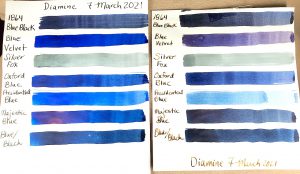
When I stumbled into 14 different ink bottles from a collection I knew it was time to do one of our famous inkfast tests and pH tests.

The results are interesting. Although they lose a bit of their luster, most of the blues are pretty tough and don’t let the sun and UV light bully them. Silver Fox barely fades at all. When still fresh looking, three of my favorite blues in production are Diamine’s “Majestic Blue,” “Blue/Black” and “Blue Velvet.” The only blue to really fade much was “Presidential Blue.”


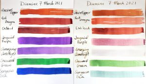
Ancient Copper holds its beauty better than most colors, and it is almost pH neutral!

Breaking into some of the more colorful Diamine inks, the sun proves more aggressive. “Ancient Copper” holds up amazingly well, but  “Red Dragon” takes a hit. “Amazing Amethyst” really takes it  hard and almost completely fades out. The very popular “Oxblood” fairs well, but it still fades a bit.

The pH testing surprised us. As a quick reminder, in the world of pH testing a 0 is extremely acidic, 7 is neutral and 14 is extremely alkali or base. We calibrated the testing device and tested the inks at 24ºC.

Diamine Ink Name              pH  Test  Result
Ancient Copper                                   6.7
Red Dragon                                        2.5
Oxblood                                              2.5
Amazing Amethyst                             6.1
Sherwood Green                                4.4
Blue/Black                                          4.1
Oxford Blue                                        3.8
Presidential Blue                                3.2
Majestic Blue                                     4.2
1864 Blue/Black                                4.5
Silver Fox                                          4.0

Before you throw out any ink you might love, please keep in mind that the pH is only a data point. We don’t know what chemicals are in each ink, and we don’t know how their chemical properties will react to your ink sacs or converters. We’ve seen acidic inks used safely in ink sacs for years and neutral inks destroy ink sacs in a matter of months.

That said, we’ve always had great success with Ancient Copper, which is one of our personal favorite ink colors.

We hope this information is interesting to you…and maybe even help you.