 Shopping Cart


A new year means a new look at different inks. As such, here are 11 more inks by the vaunted Noodler’s brand.
We test 11 more inks by Noodler’s Inks to see how well they handle UV light in a sunny window and to see how well they test with our pH meter.
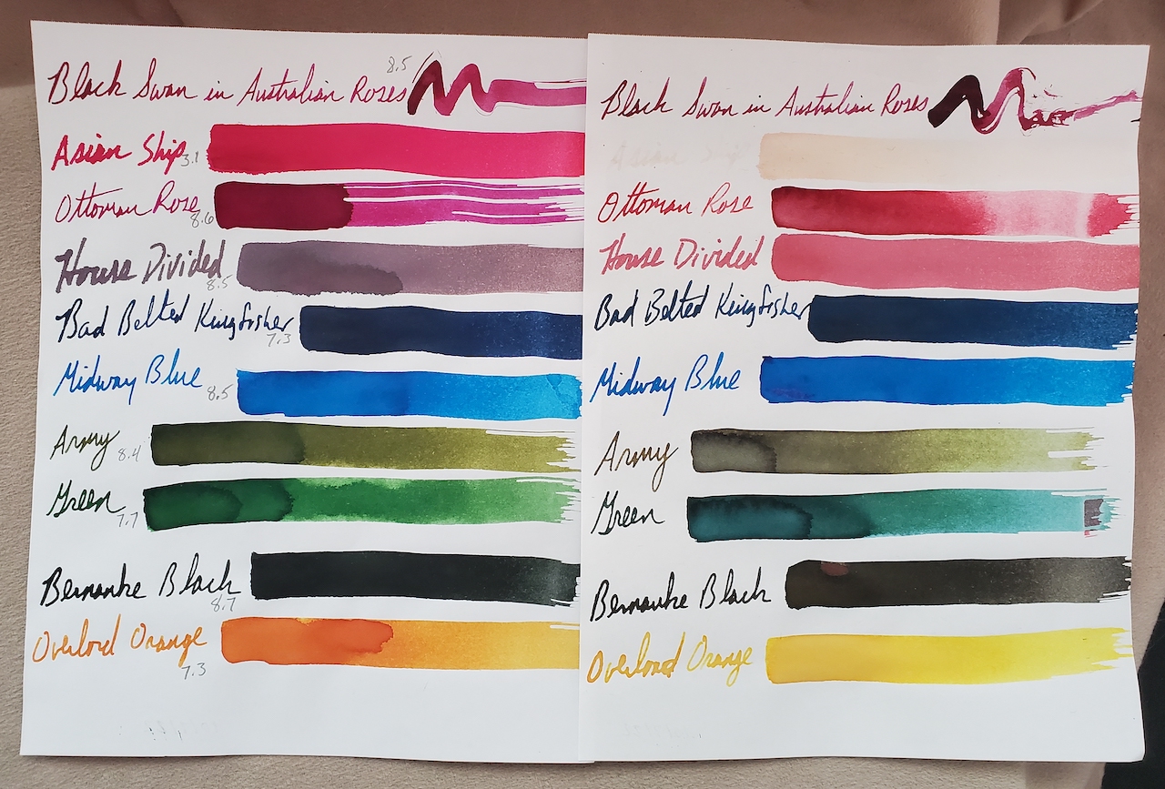
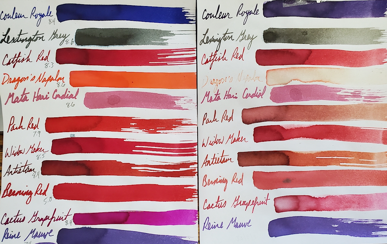
Today’s inks spent 9 months in our sunniest window. We always enjoy seeing what holds fast and what degrades. As such, here we go.
“Couleur Royale” starts a beautiful, deep, vibrant blue. Time allows it to stay dark, but it changes to a more purple color. It seems fitting, as the historical color of royals is purple. “Lexington Grey” feathers a bit, but it seems to generally hold its color under the UV rays of the sun. “Catfish Red” fades only slightly. “Dragon’s Napalm” is a stunning neon orange. Unfortunately, it almost completely washes out. “Mata Hari Cordial” is a purply pink that seems to mostly hold. “Park Red” is a brilliant red. Sadly, it fails to stay true under the sun’s light. It fades significantly with a brownish hue. “Widow Maker” red has a touch of blue that gives it a much deeper, richer red.
“Antietam” red is one of our favorite inks before or after this test. For those not up on their American history, the Civil War battle of Antietam was the single bloodiest day in American combat. The landscape and a local creek ran red with blood. This ink, in turn, looks just like blood, red with the brownish hue of iron in the blood. It still fades a bit with time and sunlight. The deep red fades to an orangy-brown mixed with the remains of the red.
The last three inks of our test also show interesting characteristics. “Berning Red” is a satirical swipe at Bernie Sanders’ politics. It is a feathering red that fades a bit to a deep orangy-pink. “Cactus Grapefruit” is a delightfully fresh, bright purple with hints of pink. Yet, it quickly fades to a pale pinky-red. Finally, “Reine Mauve” proves to be a bluer purple that holds pretty well.
When it comes to the pH testing portion, we like to remind readers that the pH value does not guarantee how the ink interacts with rubber ink sacs, converters or other materials within the pen. The pH scale runs from 0 = most acidic to 7 = neutral like distilled water to 14, which is the most alkalai or base. We calibrate our pH tester at the start of every session.
Noodler’s Ink: pH Reading:
Couleur Royale 8.4
Lexington Grey 8.6
Catfish Red 8.3
Dragon’s Napalm 8.6
Mata Hari Cordial 8.6
Park Red 7.9
Widow Maker 8.5
Antietam 8.4
Berning Red 5.0
Cactus Grapefruit 8.4
Reine Mauve 7.4
Individual results might vary. These were the results that we experienced.